Don't Trust the Naked Eye to Judge This Recovery
The scale and speed are so unprecedented that it’s little wonder so many investors have been caught by surprise already. Caution is wise.
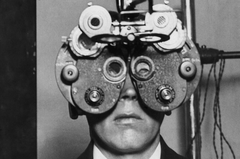
Optical Distortion
One of my favorite cases from business school was about a company called Optical Distortion Inc. Many of you will remember it. It concerned a plan to sell contact lenses for chickens. The big idea was that once chickens had special lenses in their eyes to distort their vision, they became less aggressive and less likely to attack each other. This made them much more valuable for poultry farmers, and offered an alternative to their previous process for dealing with the chickens’ pecking order, a horrific-sounding process called “debeaking.” The whole notion grew even harder to deal with on discovering that the plan was to give the chickens red lenses, so that everything would be the color of blood. That way, they wouldn’t be attracted to the sight of blood on other chickens.
Looking around the internet, I discover that Optical Distortion was indeed one of the most popular Harvard Business School cases of all time. I also confirmed that the idea never caught on. Putting a contact lens into a chicken is — as most of us non-poultry farmers would expect — quite a lot more trouble than it’s worth, and often quite cruel. Red light bulbs to bathe them in red light can have similar effect.
But the idea does have appeal at present. The extraordinary switchback that the economy took a year ago is creating optical distortion for all of us. So is the extraordinary aid poured into the economy as a result, which continues. And in any case the Covid-19 shock arrived at a point when many long-running financial and economic trends appeared to have been taken as far as they could go, or even beyond.
Looking through the last few days’ research, I found two images kept recurring. First, there are charts to demonstrate the extraordinary speed of this recession and recovery, compared to all its predecessors. Second, there are charts showing that what is happening now, in year-on-year terms, if extrapolated, is literally off those charts. The response, from investors, traders and journalists, has been very reminiscent of a large chicken coop full of aggravated chickens. If not bright red distorting red contact lens, maybe we would all benefit from rose-tinted spectacles, and some soft ambient music while looking at any data. The problem is that most of our normal frames of reference could lead us astray.
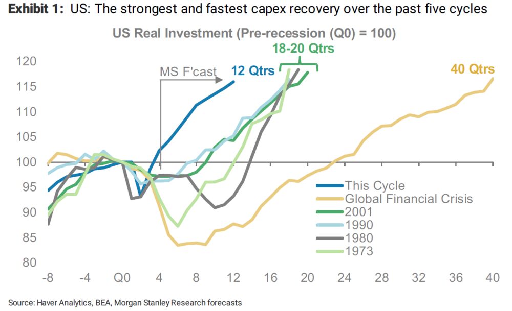
Here are some examples. First, Morgan Stanley shows this is by far the fastest recovery in capital expenditures in the last five quarters, compared to previous postwar recessions. This is nothing like the “recovery” (if it can be called that) that followed the global financial crisis, which is the chief point of comparison for most of us:
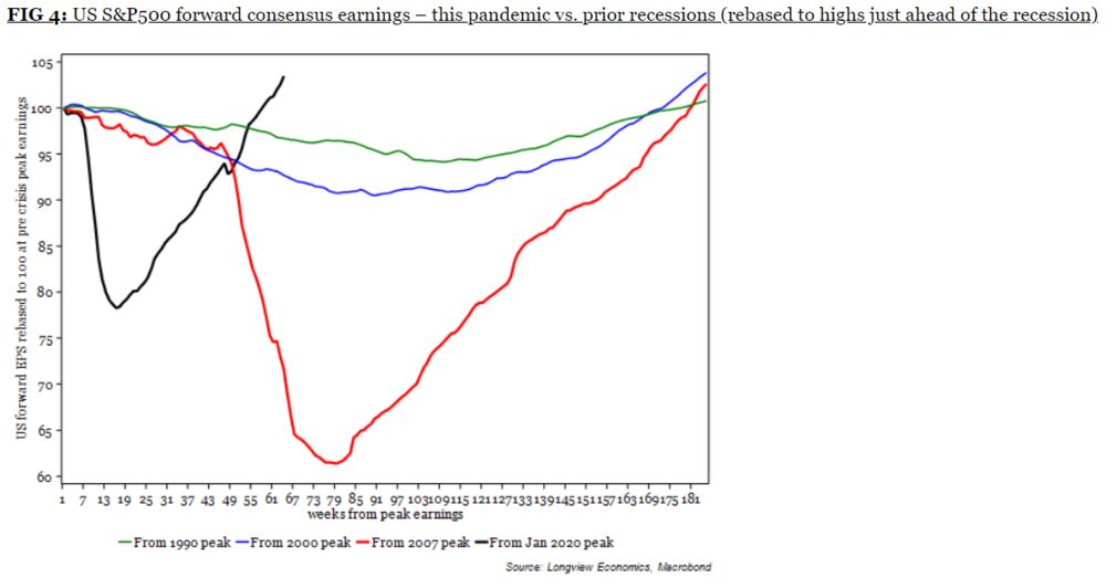
Now let’s look at the progress of forward consensus earnings forecasts, in a chart from Longview Economics Ltd. of London. Again, this recovery is beyond comparison faster than its predecessor; it’s also much faster than the two earnings recessions before that, despite having been much deeper at its worst point:
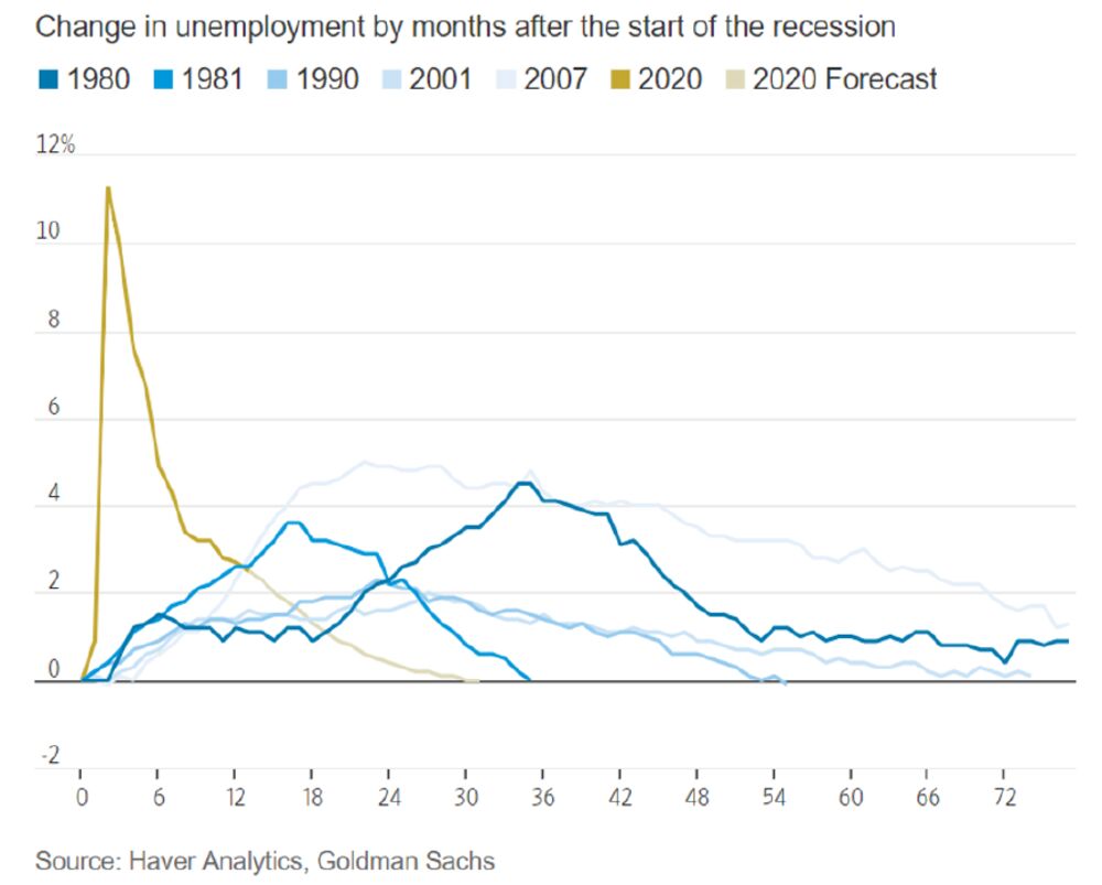
Then there is unemployment. The last number, for April, came as a grave disappointment. But this chart from Goldman Sachs Group Inc. makes the same point again; the decline in unemployment was of a different order of magnitude from anything else in the preceding four decades. While the recovery needs to go much further, the jobs market has already made up most of its losses, at a point when in previous recessions the level of joblessness still hadn’t reached its worst:
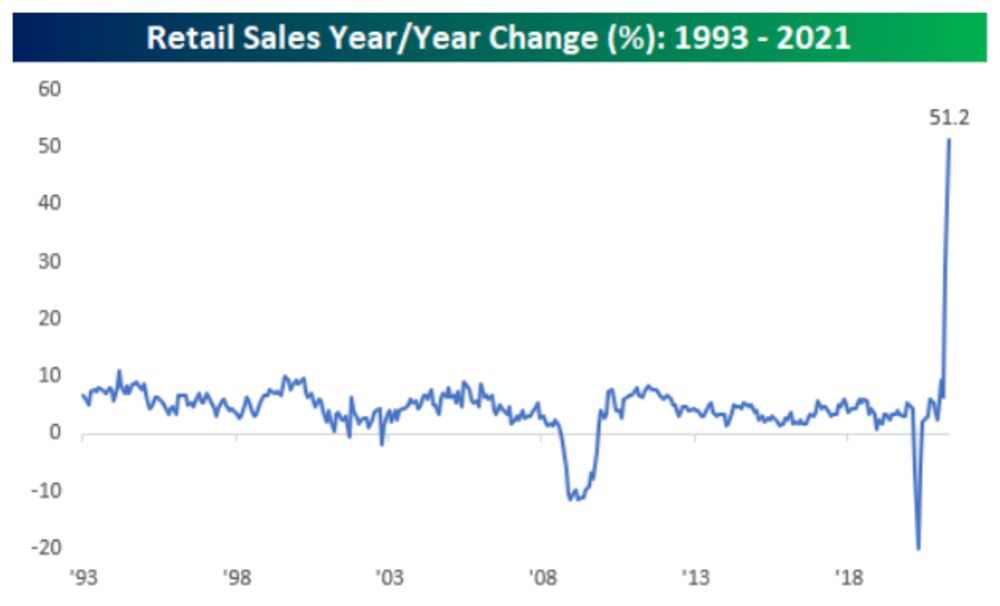
All of this leads to problems with perception, particularly when looking at year-over-year changes. The end of last week brought numbers on U.S. retail sales, which came as a disappointment. Analysts had hoped for more. On a year-earlier basis, however, the following chart from Bespoke Investment Group shows that retail sales are up a previously inconceivable 51.2%:
Or we could take a look at flows into financial assets. Nobody wants to leave money in bonds or cash, and nobody (of course) wants to miss out. So the amounts finding their way into equities are on course for an almost unimaginably high number, according to the flows kept by BofA Securities Inc. and Emerging Portfolio Fund Research. These are how net flows into global equity funds have moved in each calendar year since the crisis year of 2008:
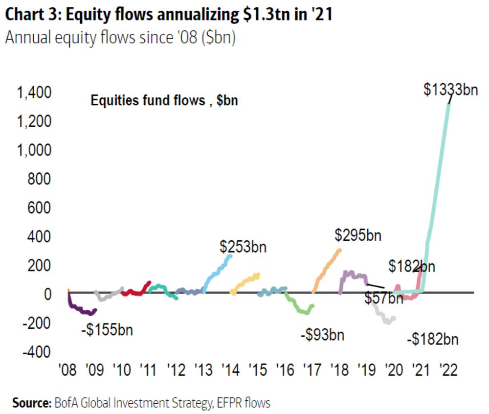
I suspect that fund managers will end the year with inflows of a bit less than four times the previous record, but these are still extraordinary sums that imply extraordinary effects on markets.
All of this has been driven to a great extent by financial aid from central banks. Money is fungible, so it is worth looking at total amounts being pumped into the system by all central banks. On this basis, it is no surprise to see record sums last spring as the pandemic shock hit. It is quite a big surprise, however, to see that central banks spent an even bigger amount on buying assets last month, when the dimensions of the pandemic were far clearer, and it was even coming under control in much of the developed world. This chart was compiled by CrossBorder Capital Ltd. of London:
To go into more detail on where this number comes from, CrossBorder reports that developed market central banks in aggregate injected $1.77 trillion, while emerging market central banks added only about $55 billion. (Although as someone once more or less said, if you take $55 billion here and $55 billion there, pretty soon you’re talking big money.) Digging deeper into the data reveals that the “big four” of the European Central Bank ($427 billion), Bank of Japan ($351 billion), Federal Reserve ($200 billion) and Bank of England ($187 billion) contributed a combined $1.17 trillion. It’s not clear to me that many market participants grasp that monetary stimulus on this scale is still on tap — and many current numbers begin to look rather different if we take the scale of support into account.
Put all of this together, and perhaps we should expect to be surprised. Attempting to judge unemployment or inflation data, both of which were savagely disappointing this month in the U.S., begins to feel like trying to discern a chicken in a coop while wearing blood-red contact lenses.
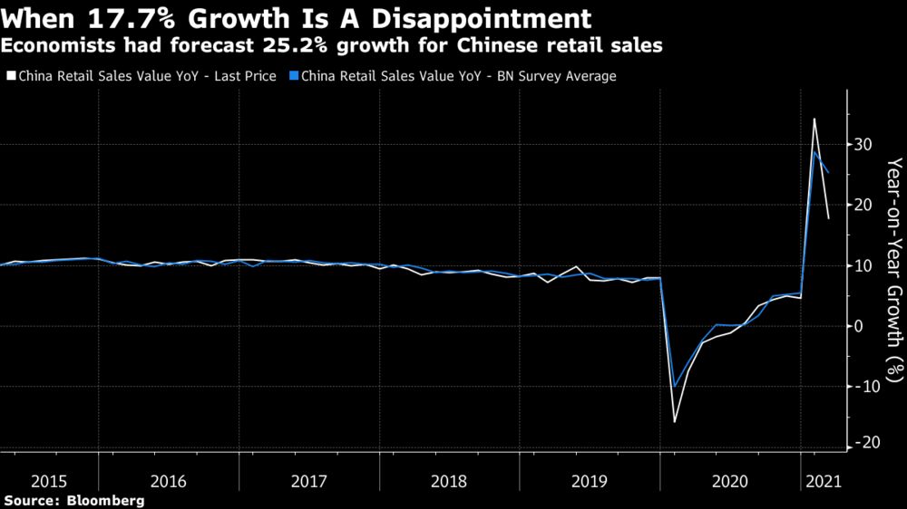
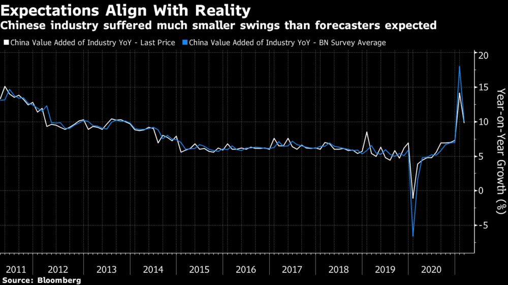
For a final illustration, look at the latest data from China, released Monday morning in Asia (late Sunday night in New York). As in the U.S., the year-on-year numbers are spectacular, but so are the disappointments compared to forecasts. Retail sales grew a stunning 17.7%, but expectations were for 25.2%:
In China, where the shock and the recovery both happened earlier, the most extreme readings are now in the past. When it comes to industrial production, growth of more than 10% was only slightly behind expectations. Meanwhile, forecasters had braced for a far worse crash in March last year, and for a far bigger rebound in March of this year — almost as though they thought their projection for last March had been correct:
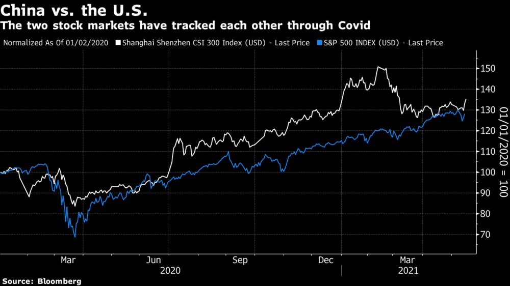
The latest numbers seem to have been well received, with China’s domestic stock market having a great day at the time of writing. That said, the effects of optical distortion are perceptible if we look at the CSI-300’s progress since the beginning of last year, compared to the S&P 500. Investors got well ahead of themselves earlier this year. It would be no surprise to see a similar phenomenon in the U.S.:
Another reason to caution against inflamed perceptions is that there is plenty of over-hyped speculative money in the system. Nowhere is this more obvious than in bitcoin, which at the time of writing has dropped by almost exactly a third (33.1%) since its high barely a month ago on April 14. This sounds bad, but by the standards of cryptocurrency trading, it isn’t. Bitcoin last formed a bubble at the end of 2017. If we take that incident as a template (and it seems a reasonable one), the there’s every reason to think that it could go a lot lower. This is what bitcoin’s price in dollar terms looks like over the last five years, when graphed on a log scale so similar percentage increases and declines appear the same size:
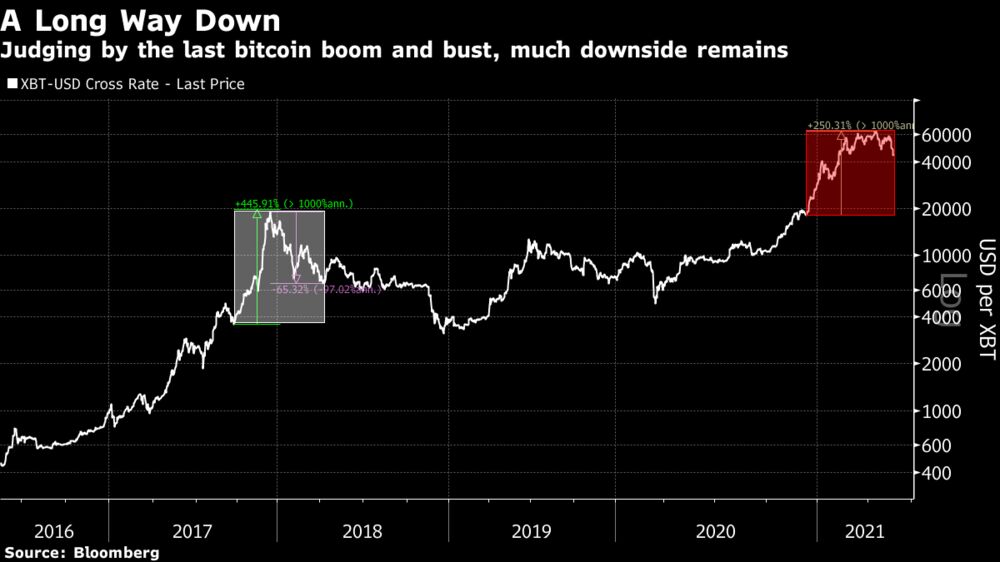
The last bitcoin bust didn’t have systemic effects, and the cryptocurrency market soon righted itself. Much more money is in crypto now. If it does stage a repeat of the last bubble, we will find out if it’s big enough to have a systemic impact.
The more important point; the economic events of the last 18 months are truly unprecedented, at least in terms of scale and speed. It’s no wonder that so many have been caught so badly by surprise so many times already. Doubtless there is money to be made by those who think they can truly perceive what is going on and what will happen next. But when visibility is this distorted, it’s a good idea to err on the side of caution.
No comments:
Post a Comment